City research Task Introduction Rut Blees Luxemburg is a German photographer. Her technique is to take photographs at night, mostly exploring the urban landscape. Luxemburg later studied photography at London College of Communication and gained her last formal education at the University of Westminster. Through out her work she was inspired by 17th centuries paintings such as Casper David Friedrich. And the German Romantic poetry of Friedrich Holderlin in 1770-1843, and employs long exposures of up to 20 minutes, to allow her to use the light emanating from the street only, for instance from office blocks or street lights in her photos. Luxemburg created a series of images for the London Underground in 2007. Many of her photographs and prints deal with nocturnal themes. When viewing Luxemburg work you can understand the particular nature of the urban environment. She is best known for her distinctive photographs of the urban landscape at night. She picks corners of the city which are obscured, overlooked or deliberately avoided after dark. Long exposure times allow the eerie artificial glow from the street which define her images. Luxemburg's scenes appear depopulated, making it difficult for the viewer to construct a narrative context. However, evidence of neglect, or threat of development, give the subject a sense of past, present and future.
Her image titled 'Folly' is a good example of this. The light seen in the image appears from a street lamp over head, suggesting dark contrasting shadows, which emphasises all areas seen in the arrangement, yet still making the subject appear quite aesthetically pleasing. The location is not obvious, therefore the audience cant associate the image within the city. Due to this aspect, Luxemburg focuses on the ignored elements of the city and tries to make the subjects emphasized and appealing to the eye. 
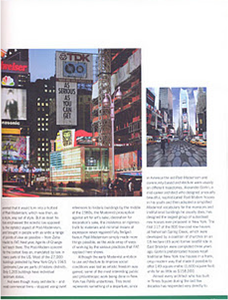
When creating 'Piccadilly's Peccadilloes' (2007), Luxemburg enlarged details from Underground stations, as reflected and fragmented by glossy-wet pavement surfaces.
The works are part of Thin Cities – a series of artwork that celebrates a 100 years of the Piccadilly line. The images are details of the front of 12 of the classic London Underground stations designed by Charles Holden. Each image focuses on the Underground’s iconic style, which is reflected from wet pavement surfaces. The subtle changes in the surface and architectural structure, frames the fragmented texts, which allow the public to absorb the essence of Holden’s designs.
When using reflections in her work she wanted to absorb the architectural Structure and frame in her designs, I think its smart that she has photographed these images in this format. Whilst portraying her Vertigo style, the images almost creates a confused appearance, as you begin to observe the image looking downwards and upwards at the same time.
In comparison to the image `Folly`, both photos have been taken form higher angles. I think by aiming the camera downwards and directly focussing on the subject, she has captured something that would not normally been noticed. Allowing to take the photo from this point of view, it allows the audience to notice the subject through the colours and patterns that Luxemburg has carefully thought to portray. I think her style almost becomes more abstract through the harsh use of pattern and line.
The atmosphere portrayed, is displayed reflecting on the absence within the city and the human interaction. Her urban landscapes pick up on subjects that could normally seem threatening, but is able to draw in the audience through the atmosphere that she creates. The publics opinions can also easily be changed through the way in which the subject is lit, but by using bright light and stereotypically happy colours, it can lift the mood and been seen in a positive light.

This photo taken by the German artist Rut Blees Luxemburg is part of a body of fourteen photographs, titled Liebeslied (Lovesong), taken between 1997 and 2000. Influenced by the German Romantic poetry of Friedrich Holderlin (1770-1843), the images present an intimate portrayal of the London landscape at night. Shot using a large-format camera using long exposures, the images capture the downhearted stillness of the city, emphasized by the glow of the ambient street light. The Glossy surfaces of the water over concrete and leaves reflected in the puddle, reveal the importance of the natural world emerging through the the urban environment.
I think the photo makes the viewer fill uncomfortable, as the colours portray a lingering atmosphere. The harsh black contrast creates the use of texture. The writing on the wall in the top left corner, almost looks like its been covered, suggesting a confusion and a hidden thought of what people may think of the urban city. In a lot of her images, she has based her photographs around poems sited by German Romantic Poet ' Friedrich Holderlin ' Reflecting on lines from his work & forming them into her own style of how the symbol could be seen in photographs. I found this idea inspiring, and mayby thought of useing this technique for a reference.

FACTS In her images individuals, traffic and human nightlife are usually absent.
- • In her images individuals, traffic and human nightlife are usually absent.
- • Blees Luxemburg has transformed a scene of urban decay into an abstract study of colour and texture through the use of light.
- • At first such modernist structures as tower blocks, 1960s council estates, car parks, empty sports grounds, urban motorways and building sites were the subject of her photographs.
Quote
“I want to suggest possibility,” Luxemburg has said, “to allow desire to enter the overlooked spaces of the city. Participation is possible in these areas… they are not controlled places, they could be so much more; sites for other things to happen. I walk the city at night, looking for the places where these contradictions are clear.”
Richard Wentworth
Richard Wentworth is known for his sculptural responses to everyday encounters, and his series titled ' making do and getting by ' helped me hugely with defining what canbe used when portraying images for a city project. Through out Richards work he changes the Values of every day objects found in the city and portrays them in different ways. The image titled `Bottle stick` is an odd image yet interesting. I think the photo looks simple yet unique. I began to think how he thought of this idea. When researching I found he relocates the sculptures he finds and uses photography to capture the object in a similar form. Similar to Street photography, he captures special moments and makes the image appear unforgotten.
I think he has photographed in a documentary style rather then the abstract, impressionist style in which Luxemburg presents. A shallow depth of field has been used, as he has focussed mainly on the bottleand the term `litter`. The scene is an everyday recognisable location that is noticed when travelling in the city. litter is something that we can all relate to as an on going issue. This is different to Luxemburg's images as the subjects are less recognisable and therefore are more open to interpretation into what the narrative is.
At first such modernist structures as tower blocks, 1960s council estates, car parks, empty sports grounds, urban motorways and building sites were the subject of her photographs. Blees Luxemburg has transformed a scene of urban decay into an abstract study of colour and texture through the use of light.
In Richard Wentworth series 'Making do and getting by' he focuses on the hustle and bustle of the city and humans impact on city life. Similar to Luxemburg's photos, the images define the elements that are normally overlooked, but within Wentworth's work, the photographer looks further into detail and uses up-close photography in order to locate these imperfections such as rubbish or cracks in the surface. His use of depth of field varies, as he defines what the importance is of the image. 
• In her images individuals, traffic and human nightlife are usually absent.
• Blees Luxemburg has transformed a scene of urban decay into an abstract study of colour and texture through the use of light.
• At first such modernist structures as tower blocks, 1960s council estates, car parks, empty sports grounds, urban motorways and building sites were the subject of her photographs.
Quote
“I want to suggest possibility,” Luxemburg has said, “to allow desire to enter the overlooked spaces of the city. Participation is possible in these areas… they are not controlled places, they could be so much more; sites for other things to happen. I walk the city at night, looking for the places where these contradictions are clear.”
Richard Wentworth
Richard Wentworth is known for his sculptural responses to everyday encounters, and his series titled ' making do and getting by ' helped me hugely with defining what canbe used when portraying images for a city project. Through out Richards work he changes the Values of every day objects found in the city and portrays them in different ways. The image titled `Bottle stick` is an odd image yet interesting. I think the photo looks simple yet unique. I began to think how he thought of this idea. When researching I found he relocates the sculptures he finds and uses photography to capture the object in a similar form. Similar to Street photography, he captures special moments and makes the image appear unforgotten.
I think he has photographed in a documentary style rather then the abstract, impressionist style in which Luxemburg presents. A shallow depth of field has been used, as he has focussed mainly on the bottleand the term `litter`. The scene is an everyday recognisable location that is noticed when travelling in the city. litter is something that we can all relate to as an on going issue. This is different to Luxemburg's images as the subjects are less recognisable and therefore are more open to interpretation into what the narrative is.
At first such modernist structures as tower blocks, 1960s council estates, car parks, empty sports grounds, urban motorways and building sites were the subject of her photographs. Blees Luxemburg has transformed a scene of urban decay into an abstract study of colour and texture through the use of light.
At first such modernist structures as tower blocks, 1960s council estates, car parks, empty sports grounds, urban motorways and building sites were the subject of her photographs. Blees Luxemburg has transformed a scene of urban decay into an abstract study of colour and texture through the use of light.
In Richard Wentworth series 'Making do and getting by' he focuses on the hustle and bustle of the city and humans impact on city life. Similar to Luxemburg's photos, the images define the elements that are normally overlooked, but within Wentworth's work, the photographer looks further into detail and uses up-close photography in order to locate these imperfections such as rubbish or cracks in the surface. His use of depth of field varies, as he defines what the importance is of the image.
Vera lutter Vera lutter works with Large-scale Camera obscura's, exposing light onto large pieces of photographic paper. once perfecting her style she then went onto hiring containers so she could photograph at different locations, specifically urban city. I found her work interesting and intriguing as I think her images show a uniqueness and an impact reflecting on the shapes saturated in the urban environment. Although I could imagine some viewers finding her work hard to read visually. The vast sizes in which she prints, relates to the term `seeing the passage of time`. When researching you read how all her images are populated with people, but due to her long exposures the people are not visible. Comparing to the photographer, Luxemburg both series of work are exposed for a varied amount of time. However Vera Lutter`s exposures can last for several hours or even days in order to get the perfect exposure. You notice her work is mainly focussed upon architecture, impressionism and shapes, defining the saying `the old and the new`.

Deconstructing Environmental Photographs
The flatiron building is located at 175 fifth avenue in he borough of Manhattan, new York city and is considered to be a groundbreaking skyscraper. Upon completion in 1902 it was one of the tallest buildings in the city and the only skyscraper north of 14th street. The building sits on a triangular island block formed by fifth avenue, Broadway and east 22nd street, with 23rd street grazing the triangles northern peak. As the French celebrated their Eiffel tower so did the Americans regard he flatiron building as the icon of a city being modernized and to be celebrated resulting in many different photographs of the building. When analysing this image I though it compared to the photo The Flatiron Building, by Alvin Langdon Coburn, as the photo is taken through the trees which takes away the harshness of the building.
The Flatiron building is often seen as a landmark of the ‘new age’ of 20th century architecture. The architectural detail and depth shown in Edward Steichen's photo appears to be lost and unfocussed. The appearance creates a ghostly pictorial composition.
Steichen began experimenting with colour photography in 1904 and became the first photographer in the united states to use the Lumiere Autochrome process. The Autochrome Lumière is an early colour photography process. Patented in 1903 by the Lumière brothers in France and first marketed in 1907, it was the principal color photography process in use, before the advent of subtractive color film in the mid-1930s.
The use of the black and white medium portrayed in this photo creates a dramatic scene and contrast applying more depth and emphasizing the light and shade tonal balance of the building.
Steichen was a leader in the Pictorialist movement, which made photography known as an art form. This made the artist creative and evident, not so much in composition but the way the photo was printed.
When analysing the photo, the image looks like it was taken in the evening, as you notice some light fog, drizzle, Wet road and fuzzy lighthouses. I think these elements build a slightly mysterious mood, similar to the photograph ` The Flatiron Building`, by Alvin Langdon Coburn.
I think the photographers intention is to illustrate the enormity of the flatiron. By focussing on the surrounding images it creates the illusion of scale when viewing the flatiron.
The blackened out branches of the tree exaggerates the frameing and shape of the building, and reflected the pavement which gave the illusion of depth. The time in which the photographs was taken symbolised the change and development of the American wealth and status. The wide angle camera lens denotes the grand design of the building, highlighting its architecture and its alien surroundings. The people within the image gave comparison towards the overshadowing architecture. However i think the camera position is based on the street, looking straight. Although I think the photographer was trying to illustrate scale, I also believe due to the Flatiron Building seen as modern, a lot of general public disliked the idea and therefore think the photographer has chosen to show the building as part of the city, creating the depth of filed as out of focus, loosing its sharpness.
The soft tones and textures and use of snow portrayed in Steichen’s work creates a similar technique towards Stieglitz piece, as they both portray a to some extent an affecting atmosphere of the ‘old’ America.
But when creating all three photos, Steichen only used one negative, the changeable colouring enabled him to create three significantly different images that convey the chromatic progression of twilight.
Edward Steichen the flatiron new York `1905`


From 1890 to 1895 he was a partner in a photogravure firm. During this period he concentrated on photographing the streets of New York City. In 1902 Stieglitz founded the Photo-Secession Movement which attempted to prove that pictorialist photography was a fine art form. He spent his life fighting for the recognition of photography as a valid art form, and from 1903 to 1917 Stieglitz was publisher and director of Camera Work magazine. The graphic section was run by Edward Steichen (1879-1973). Alfred Stieglitz: 'the Flatiron Building ‘appeared to be moving toward me like the bow of a monster steamer–a picture of a new America still in the making.’ Similar to Steichen’s work, the use of fog in Alfred Stieglitz photo creates a glum ambiance forming a sense of impediment between the subject and the viewer. Similar to Steichen’s work, the photograph captures the transitional development of a new modern American city. Camera Work was a quarterly photographic journal published by Alfred Stieglitz from 1903 to 1917. He wanted to establish photography as a fine art. He believes when capturing the perfect image, one subtle gradation of tone and value should be noticed and its artistic beauty depends. Stieglitz also subscribes to a theory that the principal subject of a photo should be in sharp focus while secondary elements should be left out of focus, you can notice when analysing the image appears slightly out of focus. The receding perspective of the shot and the tight compact crop reveals the patterns and textures of the building, creating a superior sense of depth in the composition. Whilst the detail of the architecture appears less defined. The fog and snow portrays the obstruction and symbolizes the continuity of America's status of wealth and technology. The photographer Stieglitz, saw New York as a culturally deserted environment, and used his photographs for a social documentary, altering America. The Photograph shows contrast, emphasizing the natural shape of the tree in the snow, and natural evening light is used. The building is an element of beauty, illustrating soft tones and simple shapes. When viewing the tiny figure placed on the park bench, you realise that the building creates the illusion of the figure being small. This emphasizes the height and scale of the building, and the approach of looking up . This creates a sense of dominance and power.
The black and white medium used in the photo, creates a dramatic contrast and depth, emphasizing the form and tone of the architectural building. The medium manipulates the brightness making the composition a focal point. Through out his work he used two cameras to do his work: an 8" x 10" Eastman View with a Packard Shutter and a 4" x 5" Auto Graflex with old Goerz lenses.
Alfred Stieglitz the flatiron `1903`
It is one of the earliest romantic symbols of New York City, an icon that has appeared in countless movie and television productions and on more postcards than perhaps any other modern building. It was immortalized in early photos by Alfred Stieglitz and Edward Steichen and since its completion in 1902. Years before the building went up, the triangular plot of land on which it stands was known as the "flat iron." Once farmland, it later held the St. Germaine Hotel, then the Cumberland Apartments, whose northern face was regarded as prime advertising space and was used by The New York Times to promote itself as the repository of "all the news that's fit to print." The slogan appeared there, glowing in electric lights, before it was ever published in The Times. In this photo you seen the environment is now known as the modern city, with anonymous businessmen. The Flatiron Building is a right-angle triangle, not an isosceles, as many people think. The 90-degree angle is at the corner of Fifth Avenue and 22nd Street. When analysing the image you think the photo appears out of focus, but in fact when viewing closely you realise some aspects are in focus for example the windows of the Flatiron Building. When researching, Alvin Langdon Coburn was influenced by the art photographer Fred Holland Day and his photographs captured the pictorial movement. Similar to the photographers Steichen and Stieglitz , his technique portrays a soft focus which links to the mediums shown in paintings. When observing, the use of the branch placed in the top left hand corner of the frame gives depth, and breaks the hard edge of the structure framing its focal point. The camera position is placed in front of the scene creating the illusion of a passing- by. There are a lot of similarities when comparing The Flatiron Building, by Alvin Langdon Coburn, the flatiron by Alfred Stieglitz and the flatiron new York by Edward Steichen. All three images share similar composition and camera position the presence of trees, the lighting is seen as natural evening light, and all include a street view and human figures.
Alvin Langdon Coburn
"Photography doesn’t teach you how to express your emotions; it teaches you how to see.“
Berenice Abbott was a documentary photographer; in her photographs she captured two words, such as real and now. The Photograph of the Flatiron Building is a documental representation of the American architecture. The American architecture is known for its diverse and its multicultural society. Over the years the American architecture has been shaped by many internal and external factors, and in 1938 American architecture was not known for its high level of design but was gradually getting known for its number of modern buildings and their variety of conception and form.
In this image Berenice has used a low angle tilt of the camera is similar to the work of Walter Gropius highlighting the slim design of the building and the texture.
In conclusion Edward Steichen, Alfred Stieglitz and Alvin Langdon Coburn represented the icon (The Flatiron Building) through a traditional artistic art form style, capturing the old city in its element. Whereas Walter Gropius, Walker Evans and Berenice Abbott used a documentary approach. They showed the building as an icon of modernization and emphasized the surrealism, and dominance the flatiron building is widely known for.
Berenice Abbott the flatiron building `1938`
In this photograph Gropius found the Flatiron Building profile irresistibly exciting, despite the building's old-fashioned decoration. The way in which the photograph is cropped and framed portrays an original and modern view of the building. Whereas the three images by Steichen, Stieglitz and Holland Day were shot in a black and white, Walter Gropius was photo was taken in colour. This type of medium emphasized the range of colour tones but highlighted the contrast and lighting tones that lost some depth an detail within the work of art. Unlike the other photos, you notice no street view, instead the photographer has used A low angle perspective cuts through the frame, emphasising the dynamic lines which lengthened the asymmetrical design of the building. His focus is mainly on the Flatiron Building, as he wanted to emphasize its greatness and modern architecture, denoting an art form of surrealism. This simplistic composition allows the building to be absorbed. Whereas the three previous photographs by Steichen, Stieglitz and Coburn were taken at night, the building became unnoticed.
Walter Gropius the flatiron building New York `1928`
I think In this photograph, the photographer relies on the cameras ability to capture every single detail in sharp focus. He wants the public to notice the Architectural richness and the romance of the Flatiron district. As seen form the title the photograph is taken from below. This gives the impression of the building known for being big, powerful and dominant. The angle of the shot creates the impression of height whilst communicating a sense of authority and credibility.
Evans received his inspiration for street photography form the work of avant-garde European photographs. The style in the 1930`s captured the use of geometric shapes denoting the abstract modern appearance.
Similar to Walker Gropius photograph, Walker Evans photographs the Flatiron Building from a low angle tilt, highlighting the design and texture of the architecture. Similar to Steichen and Stieglitz, Adams uses objects to frame his subject; for example his use of urban structures create an abstract form of the surroundings.
Due to the presence of the lantern shed, and the cropped framing the Flatiron Building appears as closed in creating the illusion of a defined space.
The composition of the photograph; emphasize the strong lines of architecture, which lead the viewers eyes into the main subject.
Flatiron Building, Seen from Below, New York City
Walker Evans 
The black and white medium used in the photo, creates a dramatic contrast and depth, emphasizing the form and tone of the architectural building. The medium manipulates the brightness making the composition a focal point. Through out his work he used two cameras to do his work: an 8" x 10" Eastman View with a Packard Shutter and a 4" x 5" Auto Graflex with old Goerz lenses.
Alfred Stieglitz the flatiron `1903`
It is one of the earliest romantic symbols of New York City, an icon that has appeared in countless movie and television productions and on more postcards than perhaps any other modern building. It was immortalized in early photos by Alfred Stieglitz and Edward Steichen and since its completion in 1902.
Years before the building went up, the triangular plot of land on which it stands was known as the "flat iron." Once farmland, it later held the St. Germaine Hotel, then the Cumberland Apartments, whose northern face was regarded as prime advertising space and was used by The New York Times to promote itself as the repository of "all the news that's fit to print." The slogan appeared there, glowing in electric lights, before it was ever published in The Times. In this photo you seen the environment is now known as the modern city, with anonymous businessmen.
The Flatiron Building is a right-angle triangle, not an isosceles, as many people think. The 90-degree angle is at the corner of Fifth Avenue and 22nd Street. When analysing the image you think the photo appears out of focus, but in fact when viewing closely you realise some aspects are in focus for example the windows of the Flatiron Building.
When researching, Alvin Langdon Coburn was influenced by the art photographer Fred Holland Day and his photographs captured the pictorial movement. Similar to the photographers Steichen and Stieglitz , his technique portrays a soft focus which links to the mediums shown in paintings.
When observing, the use of the branch placed in the top left hand corner of the frame gives depth, and breaks the hard edge of the structure framing its focal point. The camera position is placed in front of the scene creating the illusion of a passing- by. There are a lot of similarities when comparing The Flatiron Building, by Alvin Langdon Coburn, the flatiron by Alfred Stieglitz and the flatiron new York by Edward Steichen. All three images share similar composition and camera position the presence of trees, the lighting is seen as natural evening light, and all include a street view and human figures.
Alvin Langdon Coburn
"Photography doesn’t teach you how to express your emotions; it teaches you how to see.“
Berenice Abbott was a documentary photographer; in her photographs she captured two words, such as real and now. The Photograph of the Flatiron Building is a documental representation of the American architecture. The American architecture is known for its diverse and its multicultural society. Over the years the American architecture has been shaped by many internal and external factors, and in 1938 American architecture was not known for its high level of design but was gradually getting known for its number of modern buildings and their variety of conception and form.
In this image Berenice has used a low angle tilt of the camera is similar to the work of Walter Gropius highlighting the slim design of the building and the texture.
In conclusion Edward Steichen, Alfred Stieglitz and Alvin Langdon Coburn represented the icon (The Flatiron Building) through a traditional artistic art form style, capturing the old city in its element. Whereas Walter Gropius, Walker Evans and Berenice Abbott used a documentary approach. They showed the building as an icon of modernization and emphasized the surrealism, and dominance the flatiron building is widely known for.
Berenice Abbott the flatiron building `1938`
In this photograph Gropius found the Flatiron Building profile irresistibly exciting, despite the building's old-fashioned decoration. The way in which the photograph is cropped and framed portrays an original and modern view of the building.
Whereas the three images by Steichen, Stieglitz and Holland Day were shot in a black and white, Walter Gropius was photo was taken in colour. This type of medium emphasized the range of colour tones but highlighted the contrast and lighting tones that lost some depth an detail within the work of art.
Unlike the other photos, you notice no street view, instead the photographer has used A low angle perspective cuts through the frame, emphasising the dynamic lines which lengthened the asymmetrical design of the building. His focus is mainly on the Flatiron Building, as he wanted to emphasize its greatness and modern architecture, denoting an art form of surrealism. This simplistic composition allows the building to be absorbed. Whereas the three previous photographs by Steichen, Stieglitz and Coburn were taken at night, the building became unnoticed.
Walter Gropius the flatiron building New York `1928`
I think In this photograph, the photographer relies on the cameras ability to capture every single detail in sharp focus. He wants the public to notice the Architectural richness and the romance of the Flatiron district. As seen form the title the photograph is taken from below. This gives the impression of the building known for being big, powerful and dominant. The angle of the shot creates the impression of height whilst communicating a sense of authority and credibility.
Evans received his inspiration for street photography form the work of avant-garde European photographs. The style in the 1930`s captured the use of geometric shapes denoting the abstract modern appearance.
Similar to Walker Gropius photograph, Walker Evans photographs the Flatiron Building from a low angle tilt, highlighting the design and texture of the architecture. Similar to Steichen and Stieglitz, Adams uses objects to frame his subject; for example his use of urban structures create an abstract form of the surroundings.
Due to the presence of the lantern shed, and the cropped framing the Flatiron Building appears as closed in creating the illusion of a defined space.
The composition of the photograph; emphasize the strong lines of architecture, which lead the viewers eyes into the main subject.
Flatiron Building, Seen from Below, New York City
Walker Evans

Urban city - research
I came up with my idea for The Environment project, simply by walking round the Chatham and Rochester area, trying to see if anything interested/inspired/annoyed me. Especially in the Chatham area, I noticed a lot of littering, especially the dumping of random items such as trolleys, sofa's and all sorts. I decided it would be interesting to maybe photograph objects in the environment, positioned in interesting ways. I thought the concept of 'human intervention on the landscape' could be something to work on. To look at, and experiment how humans can change the way the environment is perceived without really noticing. I plan on photographing dumped items exactly how they were left, that way the idea of human intervention is evident.Richard Wentworth creates a series of photographs, based on the litter he finds placed down Caledonian Road in London. When researching this series I was completely inspired by the way a random object placed in an interesting way can change completely what the environment. Usually, litters seen as something disgusting and accidental. Wentworth photographs the objects in a way that they are interesting for the viewer and are the main focus rather than the environment.

First of all I looked at the photographer Richard Wentworth:
In comparison to the work of Richard Wentworth, Roger Mears' photographs of litter in the environment are on a much larger scale, I believe he's trying to show in his photograph how litter can ruin a landscape, the human intervention turns something that’s stereotypically beautiful into something abstract. I find this concept fascinating, how something so ordinary like rubbish found on the street can look completely different when added to a beautiful landscape.
Development: Comparing these two photographers enabled me to develop my idea, the two photographs inspired me to create a final image including litter that had been placed in a landscape and to therefore create an interesting final image.
Development: Comparing these two photographers enabled me to develop my idea, the two photographs inspired me to create a final image including litter that had been placed in a landscape and to therefore create an interesting final image.

In comparison to the work of Richard Wentworth, Roger Mears' photographs of litter in the environment are on a much larger scale, I believe he's trying to show in his photograph how litter can ruin a landscape, the human intervention turns something that's stereotypically beautiful into something abstract. I find this concept fascinating, how something so ordinary like rubbish found on the street can look completely different when added to a beautiful landscape.
This photograph has definitely inspired me for this project, it's interesting how he can make an image still be captivating even though the contexts isn't stereotypically attractive. A decision I now need to make is whether I want to represent litter on the streets to be something attractive or the complete opposite? Personally, I find litter on the streets frustrating and an issue I'm definitely passionate about. However, in terms of art, there's something captivating about how litter can be randomly placed, yet transformed into an interesting photograph.

When devloping my research i thought of researching into different themes, and came across the idea of artitecture and the effet it has on landscape and culture. Although i enjoyed researching about how waste can effect the city, i loved how artitecture plays a massive role in todays society. I decided to research further into this topic.
For my three photographs depicting what I think embodies 'urban landscape' I chose to focus on the old and new architecture, including the effect it's having on the landscape and our culture.
Photographs taken by Gaudi and the 'Sagrada Familia' , show a distinct style reflecting a design which is said to be influenced by the forms of nature; emphasizing the curved stones to the twisted iron sculptures. This eccentric artistic building, symbolises the futuristic design.
Gaining this knowledge helped locate photographers that I think will inspire me to develop further.


The items photographs range from personal belongings to steel girders and burnt out viacles. The items were all stored at hanger 17 at JFK international airport. This was a personal project for Torres as he lived only two blocks away from the twin towers and had to watch the destruction. He said that there was an emotional power of what remained and that 'though remains of history memory remains' which beautifully sums up the intentions of this exhibition.


I began looking at architectural design that had a futuristic style. The `'Digital Photography Techniques' magazine had an article that specialised in this design.
The photographer Stewart Hardy, is a photographer who takes photos all over the UK. His main interest is in modern architecture, examining the shapes and perspectives. landscapes are also featured in his series of work, portraying the importance of a good leading line and a wide perspective. His use of colour, lighting, surface textures and shapes etc create the modern and futuristic movement. whilst other architectural photographers, focus on the buildings as a whole, highlighting the impact it has on landscape.
When researching i thought the artist Boris Becker gave me much inspirtation and ideas. His work relates to my theme, as he too looks at the effects of humans and questions our perception of how reality is presented - what is being photographed and the effect of it. The majority of his photographs are taken in Germany, Italy, Belgium and Poland. Although he doesn’t focus so much about architecture he looks closely at the study of human existence and how we use our landscape and surroundings.
Unfortunately I was unable to go to the Antwerp Photographic Museum, to view the exhibition of the German photographer Boris Becker's works, so therefore I researched into videos that talked about his work.
Here is a link for a video about his work: http://dai.ly/c22NCf
In the 1980`s he began photographing storage bunkers. He used black / white and colour photographs to examine what lies underneath the structures, rather than hiding their function , he reveals them instead. The theme links in within all his urban architecture series of work. The buildings are never seen as the designer's vision, but instead show the modern social requirements, shapes and structures that create an artistic quality.
What I find interesting about his work is how he doesn’t go looking for his subjects, instead finds them. Structures, composition, linear arrangements and sculptural shapes are an important factor in Becker's work, creating a sense of space and isolation. The abstract feel to the shadow less buildings, creates a neutral stance for the subjects. The large scale prints and sharp focus enables the audience to see the finer details of the composition, and photographing in a series enables a continuous story to be told.
Imperial war museum trip
Francesc Torres
As a group we visited the Imperial war museum. This trip was very appropriate for my 'City' project within the second part of my study of environment photography. The trip gave me inspiration and thoughts for ideas of what I could later develop throughout my environment project.
The first photographer that we looked at was Frances Torres. His exhibition 'Memory Remains' Was a collection of 150 projected images to mark the 10th anniversary of the attacks on September 11th. The images were of items and materials that were recovered from the World Trade Centre after the attacks.
Although i didn’t find the images aesthetically pleasing, i could value the point that they were making. I feel the thought of photographing the remains was admirable, as I thought it symbol a mark of respect, due to a sign of remembrance. I personally thought the images of peoples personal belongings was emotional, because I brought to light the realisation that although many died they were still ordinary individual people.
The items photographs range from personal belongings to steel girders and burnt out viacles. The items were all stored at hanger 17 at JFK international airport. This was a personal project for Torres as he lived only two blocks away from the twin towers and had to watch the destruction. He said that there was an emotional power of what remained and that 'though remains of history memory remains' which beautifully sums up the intentions of this exhibition.
The other exhibition that we looked at was Don McCullin 'Shaped by War'. McCullin was a photojournalist and was sent to document wars and conflicts across the world in places such as …Vietnam, Lebanon, Cyprus, Berlin and Cambodia. His powerful collection is shocking but is to show the 'truth of war'.
McCullin put his life in danger on a regular basis as he would live in the same conditions as the soldiers. If he successfully achieved this task he was able to take his photos, showing him amongst the fighting and gunfire.
Throughout his work he should great respect for those that were in the war. His work appears as intrusive, for example photographing people in death beds and in extreme desperation.
The image above was of a family after the news of a death of a family member.McCullin has managed to capture an extremely raw moment. I think this is what makes his images so powerful.When human beings are suffering, they tend to look up, as if hoping for salvation. And that’s when I press the button."- Don McCullin. To me this quote shows that although he can never predict what is about to happen, his images are well thought out and intentional.
urban city research
Rees Luxemburg /urban city research
Rees Luxemburg documents her subjects mainly in Los Angeles; looking closely at urban areas; wither it be stairwells, tower blocks or underpasses. My favourite seriers of work was his high rise blocks of flats in the East End of London just off City Road in 1995. You notice the ambient light of the flats allow the audience to view into another perosns world, a world kept from the public eye and exposed for a brief moment. i think limiting the light breaks up the sculptural quality, unable to identify the artitectural design. However i like how the long exposure time creates a sense of time passing by. The use of ambient light can be seen in the majority of Luxemburg’s work, creating suspension and a potential encounter in the forgotten corners of an urban landscape. From researching her work, i think most of her photogrpahs create a sense of isolation; an awareness of a quiet cityscape, absent of traffic, people and other human activities.

As I have researched for a clear idea of what I might be capturing of the city, I have gradually came to the understanding that not a lot has changed within city's, except modernization. Looking at the work of Alfred Stieglitz in the 1930's, particularly the photo "Looking Northwest from the Shelton" , cities have not changed for a long period of time. all building contain a taller design, that alone may look astounding, but with a number of them could lose all value and meaning. This is an area that would end up touching on post-modernism a topic that I could explore further.
As I have researched for a clear idea of what I might be capturing of the city, I have gradually came to the understanding that not a lot has changed within city's, except modernization. Looking at the work of Alfred Stieglitz in the 1930's, particularly the photo "Looking Northwest from the Shelton" , cities have not changed for a long period of time. all building contain a taller design, that alone may look astounding, but with a number of them could lose all value and meaning. This is an area that would end up touching on post-modernism a topic that I could explore further.
urban city research
As i wanted to devlop my theme of old and new, i began looking at the city landscape of Chicago depicting the presence between the old and new buildings compressed into strips of sprawled urban land. You notice the buildings on either side of the frame draw the eye to the horizon dividing up the composition into two parts. Whereas when looking at the persepctive in the photographers, Luxemburg’s work he positions the camera higher than eye level in order to create a wide angle view of the landscape, relating the reference points to one another to emphasize the grandeur nature of it. I thik the long exposure times outlines the buildings, creating a ghost like form. This allows the objects to be seen in motion, moveing in and out of the frame.
I think the use of verticla lines in the road and the repeated rectangles in the architecture create an abstract design, allowing the buildings to be cropped out of the picture, createing an impression of the landscape spilling out from the composition. The varied heights of the buildings also create varied focal points, emphasizeing the rapid and evolving landscapes of the cities.

I think the use of verticla lines in the road and the repeated rectangles in the architecture create an abstract design, allowing the buildings to be cropped out of the picture, createing an impression of the landscape spilling out from the composition. The varied heights of the buildings also create varied focal points, emphasizeing the rapid and evolving landscapes of the cities.
I found these images really interesting as i was fasinated by the date of the photograph, September 11th attacks of 2001 are a poignant event in history. You begin to notice that the ghostly horizon represents the absence of not only the structure of architecture, but the many lives lost . ‘Studies of Ground Zero’ highlight the destruction of the World Trade Centre. And the pale light created by the camera obscura contrasts the dark background, creating an eerie effect. This lonely area of the city i think highlights the absence of the building.

Whilst keeping with the theme `old and new` i was drawn to these dream-like cities, all of which illustrate a future city, they all fall into the Sci-Fi genre, but as I contemplated about these extreme, intense and potential cities, I began to realise, that in today, these cities are very much in reality, there is no difference between each city, all cities look the same as all are becoming modernized.
Mike Seabourne

Research – magazine- reference Whilst looking and researching through the university library, I wanted to locate books or magazines that analysed and talked about 'Architectural design‘. The issue looked at the post modern take on the architecture of the world, and gave me inspiration when developing my own initial ideas. The magazine 'Architectural design‘, gave me a lot of information about the post modern take on the architecture of the world. The article enabled me to look at the changing design's and landscapes of buildings etc.
I looked at the magazine for a reference, but I learnt and gained knowledge about the changing design's and landscapes of buildings etc…
I looked at the magazine for a reference, but I learnt and gained knowledge about the changing design's and landscapes of buildings etc…
When reading through, I was interested about the article ` Blue House in Hackney London`. When observing the image the house looked extremely modern almost re-venerated. The rigid lines on the house capture the contemporary feel, yet in the article it reads they have traditional objects such as architraves that are used to bring a traditional, yet balanced scale to the home. I think this magazine reflects to my idea of the old and new and maybe will research and find locations that capture the old and new design.
Most of the articles in this magazine observe how architecture and landscape change over the years highlighting the importance and effects that technology and media have on the urban city.

Most of the articles in this magazine observe how architecture and landscape change over the years highlighting the importance and effects that technology and media have on the urban city.
Edward Steichen / urban city
Edward Steichen
Throughout my research I've felt the photographer Edward Steichen has been a huge inspiration of mine. His work in the 19th century was noticed as being the romantic movement called Pictorialism, and he metamorphosed rapidly into one of the leading lights of modernism. Steichen was one of the first to bridge the gap between creative photography and editorial, illustrational, and other applied usages of the medium and In the early decades of the century Steichen, in collaboration with Alfred Steiglitz, helped found the Photo-Secession and its influential journal, Camera Work.
The image I most admired was the series titled the flatiron building. He tried to emphasize the tallness of the building as it was well known for being the tallest in the city, and how he captured all angles to identify the abstract design( The new era : modernism).

Due to this reference, I also researched other photographers that were inspired by architecture and came across, Mike Seabourne. Again his work picks up on this loss of originality within cities, and how everything looks similar capturing no individuality. I wanted to explore further into architecture design and how it changes through out the years, identifying the term old and new.
His work explored obvious development within the city, and came to photography through his boyhood interest in railways.
His work explored obvious development within the city, and came to photography through his boyhood interest in railways.
Whilst exploring the old industrial areas of the capital he discovered the Isle of Dogs and the derelict West India and Millwall Docks. Soon to be designated 'Docklands', this part of London was clearly on the verge of transformation and Mike set about documenting the landscape before it disappeared forever. The resulting pictures evoke a lost riverside world which is in stark contrast to the thriving Docklands of today.
From the 1990s Mike broadened his range of subject-matter and developed a particular interest in the landscapes created by the various housing schemes in London from the 19th Century to the present day. More recently he has been photographing in the lower Lea Valley, site of the 2012 London Olymics, and other areas in transition, specially the inner city, where rapid change is occurring as a result of social/cultural forces such as gentrification and ethnic concentration.
I enjoyed researching about his work and the theme of the severity of the development. The buildings refer to the term `monster like` as when looking they tower over the original buildings, symbolising the term old and new.
I enjoyed researching about his work and the theme of the severity of the development. The buildings refer to the term `monster like` as when looking they tower over the original buildings, symbolising the term old and new.
docklands / urban city idea
For my urban city environment project I wanted to reflect on the old and new architecture, and how this impacts today's society.
The changes that have been made to the London Docklands in the past 25 years have been among the most striking and most dynamic developments in the world. The London Docklands Development Corporation (1981-1998) played a huge role in the area transformation, turning what used to be an industrial wasteland into a vibrant area for commerce, residential life, and tourism. The area of the Docklands is over eight and a half square miles, all of which have been affected by the new developments in businesses and transportation. The Docklands represents one of the largest concentrations of twentieth and twenty-first century architecture in the world, and with new projects in development now, it will continue to grow, benefiting not only the area but London as a whole.
The changes that have been made to the London Docklands in the past 25 years have been among the most striking and most dynamic developments in the world. The London Docklands Development Corporation (1981-1998) played a huge role in the area transformation, turning what used to be an industrial wasteland into a vibrant area for commerce, residential life, and tourism. The area of the Docklands is over eight and a half square miles, all of which have been affected by the new developments in businesses and transportation. The Docklands represents one of the largest concentrations of twentieth and twenty-first century architecture in the world, and with new projects in development now, it will continue to grow, benefiting not only the area but London as a whole.

The history of the London Docklands dates back to the early 17th century, when the first docks were built as a part of the East India Company. The number of docks began developing, and experiencing a boom during the 1800`s. The Docklands later reached their peak in the 1930s when over 100,000 people were connected to the Port of London through their jobs. However, in the post-World War II years, people began to see the decline and the closure of docks around the world, and therefore the docklands of London were no different. New technology, such as containerization and air transport made the docks seem old-fashioned and no longer as useful as what they once were. Many docks around this area were closed in the 1960s, leaving behind empty warehouses and creating a very uninviting environment.

The word derelict was most used to describe the docklands in the 1970`s and early 80`s. By 1981, 59.7% of lands and buildings that fell under the control of the LDDC were considered derelict, vacant, under-used, or unused. As the skills of the people in the area were not appropriate for new industries, the docks later experienced a severe loss of jobs from 1978-1983.
The condition of property in the Docklands was so bad, that most investors didn't wish to take a gamble on trying to develop the property. Plus, there was very little transportation between the Docklands and Central London, meaning that if the area was to be refurbished, investors would also have to pay for transportation improvements to make the area more accessible, a project that would take on millions, if not billions, of pounds. The Docklands were in a downward spiral, and without intervention, the situation looked bleak.
However, in 1981, hope came for the Docklands. The London Docklands Development Corporation (LDDC) was founded in the Local Government Planning and Land Act of 1980 with four primary goals, this included, making the lands and buildings useful, encouraging new industry and commerce in the area, ensuring good housing and amenities for its residents, and creating a pleasant environment. Instead of relying on a grand plan for development, the LDDC instead focused on market-led development in order to be more flexible.

One of the first challenges faced by the LDDC was transportation. At first, the company wanted to see how much more access the new developments would demand before spending millions on building new roads. Because of this, the construction of new roads was ongoing, but as they built, they found the new roads were actually insufficient to handle the amount of people that came with the new developments. It appeared that the redevelopment might fall apart, if new transportation systems were not put into place. The Docklands Light Railway, was built in a monorail style which alleviated the strain, but didn't solve the problem entirely, though in today's society, it can carry approximately 80,000 people daily. An extension to the Jubilee line was proposed, and while it took several years to be approved, it was ultimately successful and was completed in 1998 with stops in Canada Water, Canary Wharf. Furthermore, over 72 miles of new roads were built in order to make the area, especially the Isle of Dogs, more accessible from Central London. And in today's culture, the Docklands are easy to get to by train and car, and the success of the area is due in much part to its improved transportation.

In addition to building up the area's industry, the LDDC wanted the Docklands to attract new residents and improve the housing in the area. New housing developments were created all over the docklands, many portraying a unique post-modern exterior. Due to these developments being built quickly, many have pre-fabricated interiors which can be assembled off-site and then put into place like a puzzle. Many of the developments are now local landmarks due to their unique look, such as The Cascades apartment block off Westferry Road, which is one of the most well-known buildings in the entire Docklands. The expansion and improvement of housing invited thousands of people to the Docklands, allowing the area's economy to expand and pay back much of the cost of the development. The area is extremely popular with young bankers, lawyers, etc… because of its prime location to businesses in the area, chic living, and great selection of stores and restaurants, the area is described as being like a pretty, new, clean, large Midwestern city on the Great Lakes. When located in the area, you don’t experience the same hustle and bustle of central London, instead you find wider roads, more sunlight, and an atmosphere that is a touch more relaxed.

Perhaps the most iconic development in the London Docklands is the area known as Canary Wharf, on the northern end of the Isle of Dogs. Development of Canary Wharf began in 1982, with the conversion of an old warehouse into the television studio complex Limehouse Studios. This work was created to revitalize the area, creating a different kind of development, in this case, the television industry. In time, Canary Wharf will carry on development, and continue to grow and attempt to attract many different groups to its land.
As with the rest of the Docklands, Canary Wharf development began as a primarily low-rise complex. In effort to maximize floor space to entice firms to move there from the City, high-rise development was called for, despite the protestations of many, who claimed that high-rise development would be too visible, particularly from Greenwich Park. In spite of this, it was decisive that this new development would be situated directly above the Docklands Light Railway station in the centre of Canary Wharf.

In the late 1980`s, in effort to start work and control over the development, it was passed on to the North American firm Olympia and York, already known for their designs of Flemington Park in Toronto and the World Financial Centre in New York City. Olympia and York were chosen because of their ability to take an undesirable location, and make the area striking to tenants with elegant buildings and extensive landscaping. Similar to their work in downtown Manhattan, their design took into account the scenic location on the Thames. With over 25 acres of land being set apart for waterside promenades, as well as boulevards, parks, and squares, they wanted to make sure that the water played an important role as a visual element.

For the most iconic building in the Canary Wharf development, Olympia and York called on architect Cesar Pelli to design a skyscraper at 1 Canada Square, immediately adjacent to the DLR station in the centre of Canary Wharf. Pelli had worked with Olympia and York on the World Financial Centre, and the Canary Wharf Tower looks similar to its Manhattan sibling a tall, severe tower with slight stepped recessions and a pyramid peak. When the building was built in 1991, the Canary Wharf Tower was somewhat at odds with the rest of the development, having been clad in Welsh stainless steel instead of the stone Olympia and York asked for. Pelli claimed to have done this to further his goal of making a simple, yet pure design. His use of steel cladding was incredibly innovative for his form, as it had never been used on American skyscrapers before, but Pelli had intended to make a skyscraper that was not American, and that it didn't fit neatly into the three main styles of Classical, Gothic, and Art Deco? His design managed to incorporate he style of an American building and adding to a distinct touch of British high-tech. At 800 feet in height, the Canary Wharf Tower is the tallest building in Britain, and one of the tallest in Europe.
However, One Canada Square is not the only skyscraper in the Canary Wharf development, It's since been joined by 8 Canada Square, and 25 Canada Square, both standing at approximately 650 feet in height. All three towers are fully rented out as office space, and together, they draw the eye upwards, creating a spectacular skyline sometimes described as a miniature Manhattan. This style of architecture links back to the photo the flatiron building produced by the photographers Walker Evans, Berenice Abbott, Edward Steichen, and Alfred Stieglitz.
As an originally industrial area, the Docklands have made much improvement in the last quarter century. For a district that was initially the overflow of commercial space from the City of London, the Docklands have shown a lot of dynamism, and are now able to compete with the rest of London as an economic powerhouse. Much of this, had to do with the dramatic overhaul of the district firms like Olympia and York that made the Docklands an appealing place to work with its graceful landscaping and dignified architecture. The Docklands area is known for its elegance commercial centre, and has earned nicknames like Manhattan-on-Thames or Wall Street on water. With development of the area continuing, and transportation made much easier, one can only imagine what the Docklands will look like in years to come.
Below is an image created by a computer-generated model of what the Docklands might look like in just a few short years.

I hope to travel to the dockland site, and take some test shots for my final prints.


EMPTY WAREHOUSE IN DOCKLANDS TRANSFORMED INTO MODERN ARTITECTURE
FINAL PRINTS

St. Marys island shoot
During my workshops three of the groups and I travelled to St.Marys island to shoot some architectural buildings. I processed my negatives, but due to dull weather, the lighting wasn’t great, therefore the detail and depth of the prints were lost. However I was really interested in the location as the buildings were newly built, reflecting the old an new, and the creative and innovative architecture; a theme that I was thinking about pursuing.

No comments:
Post a Comment